Shwetacreates -Logo Projects
OUR CLIENTS


Goalden Star - Community by Alok Taunk
The Goalden Star logo, designed for Alok Taunk—a leading Mindfulness & Mindset Coach and founder of Eastern Mindfulness—symbolizes clarity, growth, and the journey of self-development. Inspired by the North Star, the design subtly integrates the letter "A" to reflect aspiration and achievement, with upward elements representing progress and personal elevation. Its clean, balanced form captures the essence of mindfulness and focus, perfectly aligning with Alok's mission to empower individuals toward a clear and confident life.


Line Upon Line - Tax and Accounting Services
This logo represents the legacy and trust of a 25-year-old tax and accounting advisory firm based in Northern California. At its center is a bold, red diamond-shaped emblem, symbolizing precision, strength, and financial clarity. The gem-like structure reflects the firm's meticulous approach and long-standing commitment to accuracy. The clean horizontal lines and elegant typography emphasize professionalism and structure, while the tagline “We Know Taxes!” reinforces their expertise. This timeless design reflects a brand built on decades of reliability, integrity, and client-first service.


Flomarine Marine Services - Lamborghini 63 Yacht Service
It features a stylized "F" incorporating the outline of Florida, symbolizing the company's roots and commitment to the region's maritime industry. This design element reflects the company's dedication to providing comprehensive Lamborghini 63 yacht and marine services across Florida. The logo's clean lines and nautical color palette convey professionalism, reliability, and a deep connection to the maritime world. Overall, the logo encapsulates Flomarine's mission to deliver top-tier marine services with a strong regional focus.


Glory Immigration - Australian Migration Consultancy
It is a trusted Australian migration consultancy with offices in Sydney, Canberra, Darwin, and Adelaide. Specializing in Australian visas—including skilled migration, partner, parent, visitor, and employer-sponsored categories—Glory Immigration offers comprehensive support from visa application to post-arrival settlement. Their logo features a bold, modern "G" enclosed within dynamic diamond lines, symbolizing clarity, direction, and global mobility. The clean lines and professional typography reflect the firm's commitment to guiding clients through their immigration journey with integrity and excellence.


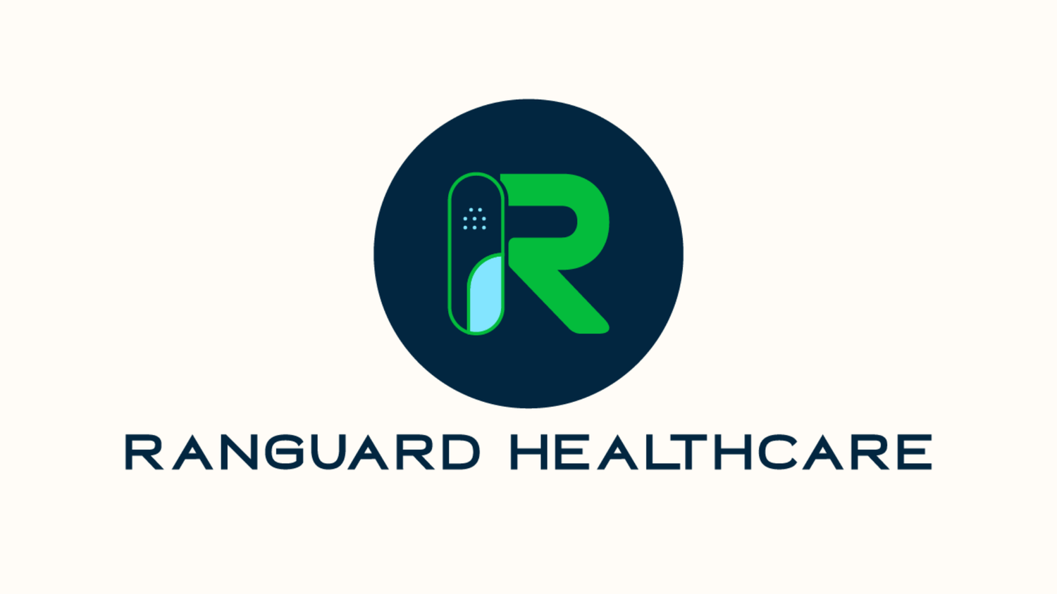
Ranguard Healthcare Private Limited - Pharmacy Brand
This logo integrates the letter "R" with a stylized capsule/pill to represent the brand’s core identity in the pharmaceutical and healthcare sector. The pill, split between solid and gradient tones, symbolizes healing, protection, and the fusion of science with care. The circular backdrop reflects wholeness and continuity, while the bold, clean lines convey trust, innovation, and a commitment to delivering reliable, accessible healthcare solutions. This design captures Ranguard’s mission to safeguard well-being with professionalism and compassion.


The Mindful Community by Alok Taunk
Redesigned logo for The Mindful Community, founded by Alok Taunk—a renowned mindfulness coach, TEDx speaker, and founder of Eastern Mindfulness—beautifully captures the essence of inner growth, balance, and awareness. The central lotus icon, a timeless symbol of purity and spiritual awakening, reflects the community’s mission to promote conscious living and emotional well-being. The deep navy background represents calmness and depth, while the golden lotus conveys elevation, enlightenment, and personal transformation. Together, the design embodies a serene yet powerful space where individuals come together to evolve mentally, emotionally, and spiritually.


Redditus - Appliance Rental Brand
The Reddtitus logo features a sleek home outline symbolizing comfort, reliability, and a sense of belonging. At its core lies a geometric infinity symbol with sharp, structured edges—representing continuous service, long-term affordability, and a modern approach. This balanced design reflects the brand’s promise of flexible, uninterrupted appliance rental solutions, making every house feel like a well-equipped home.


The Etiquette Connoisseur - Germany Brand
The Etiquette Connoisseur logo reflects timeless elegance and balance, combining classic typography with modern sophistication. The clean lines and diamond motifs symbolize grace, structure, and attention to detail—perfectly aligning with the brand’s mission to cultivate refined manners and confident presence in every individual.


Fruit Sing - Fruit Delivery Brand
A cheerful and vibrant logo crafted for a premium fruit delivery service. The smiling fruit icon, formed by playful curves and bright yellow-orange hues, conveys freshness, joy, and quality. The twin green leaves symbolize nature and health, while the bold typography in green and orange reflects the brand’s lively, organic spirit—bringing handpicked goodness straight to your doorstep.


Sweet Whisk By Priyanka- Bakery Brand
It is a charming bakery brand known for crafting bespoke cakes, cupcakes, and gourmet desserts with an artistic flair. The logo, set against a cheerful pink circle, features elegant white typography—where the flowing “S” and the whisk icon in “Whisk” capture the essence of creativity and baking passion. The handwritten “By Priyanka” adds a personal, homestyle touch, reflecting the brand’s dedication to love-filled, handcrafted treats. Sweet Whisk blends sweetness and style, making every bite a celebration.


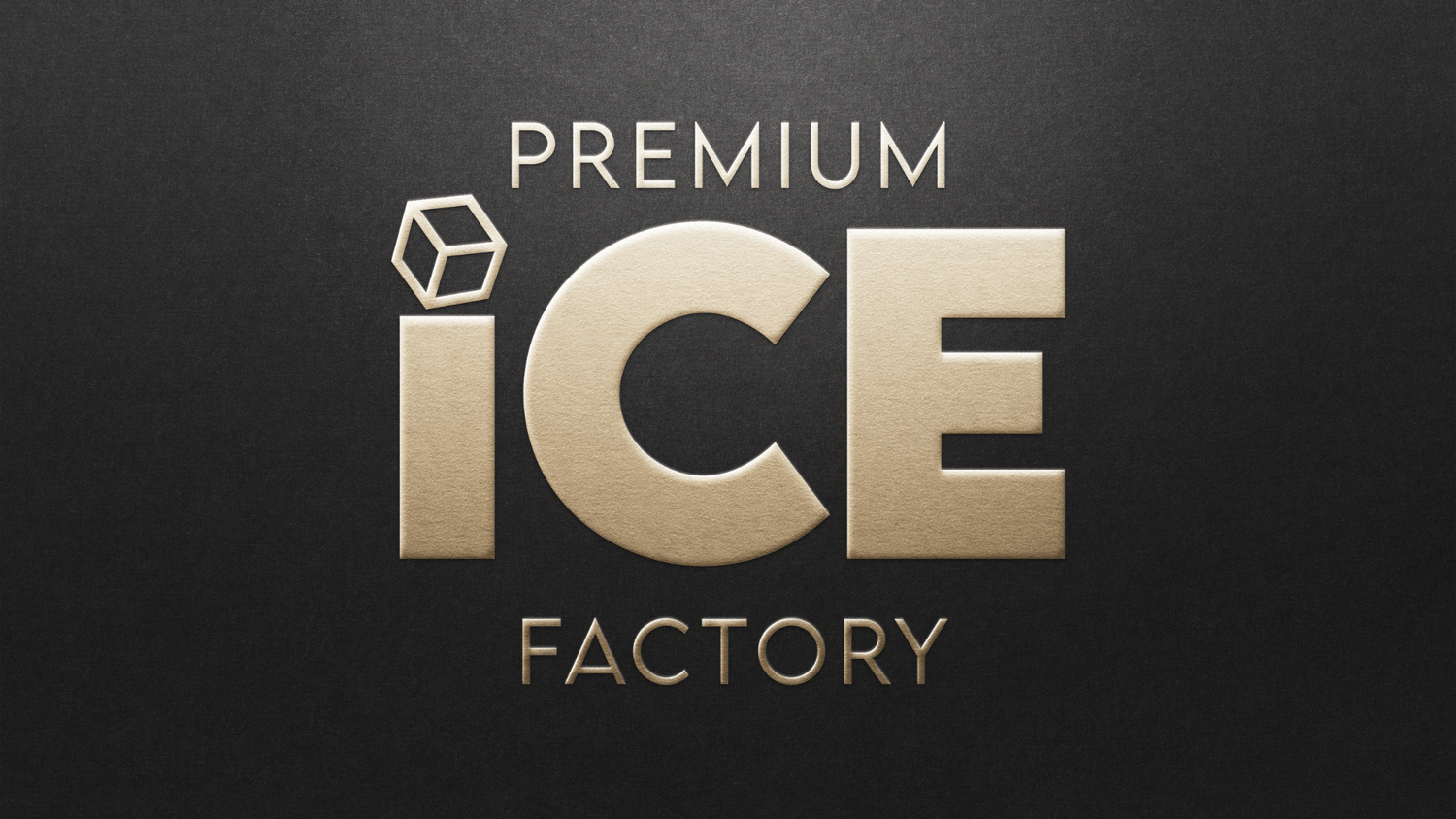
Premium Ice Factory - Premium Ice B2b Brand
This logo embodies sophistication and clarity. Featuring bold, metallic typography with a 3D ice cube subtly placed above the “I,” the design reflects purity and precision. The sleek gold-on-black aesthetic speaks to the brand’s luxurious appeal, aligning perfectly with its mission of crafting exquisite ice — from timeless cubes to custom-designed creations for refined tastes.4o


Norog Life - Ecommerce Brand
The Norog Life logo beautifully blends nature and vitality through its graceful green emblem and elegant typography. The design features leaf-inspired elements forming a human-like figure, symbolizing harmony, nourishment, and holistic wellness. With its tagline "The Ultimate Bliss," Norog Life reflects its mission to enrich human lives by promoting healthier lifestyles and offering wholesome, delicious food — empowering individuals to live life to the fullest.


Bubble Bubb
A playful and heartwarming logo that perfectly reflects this affordable baby essentials startup. Set against a soft cloud shape, the pastel-toned typography feels gentle and inviting — just like the swaddles, bibs, and cartoon blankets it represents. The whimsical rainbow and bubbly dots symbolize joy, innocence, and care for little ones aged 0–2. With its bright yet soothing palette, the logo captures the brand’s promise of comfort, cuteness, and quality at every stage of early childhood.


Bite n Delight
The logo for Bite n Delight smartly integrates visual storytelling with cultural authenticity. The letter “T” has a visible bite mark, cleverly emphasizing the word “Bite” and instantly connecting with the idea of snacking. The letter “n” is encapsulated in a circular element that resembles a savory snack or chutney dip, placed centrally to balance the composition. The bold white typography against a vibrant orange gradient background evokes warmth, hunger, and traditional Indian flavors. The word “Delight” in classic serif font adds a touch of tradition and richness—perfectly reflecting the brand’s mission: Bringing authentic Maharashtrian snacks to your table.


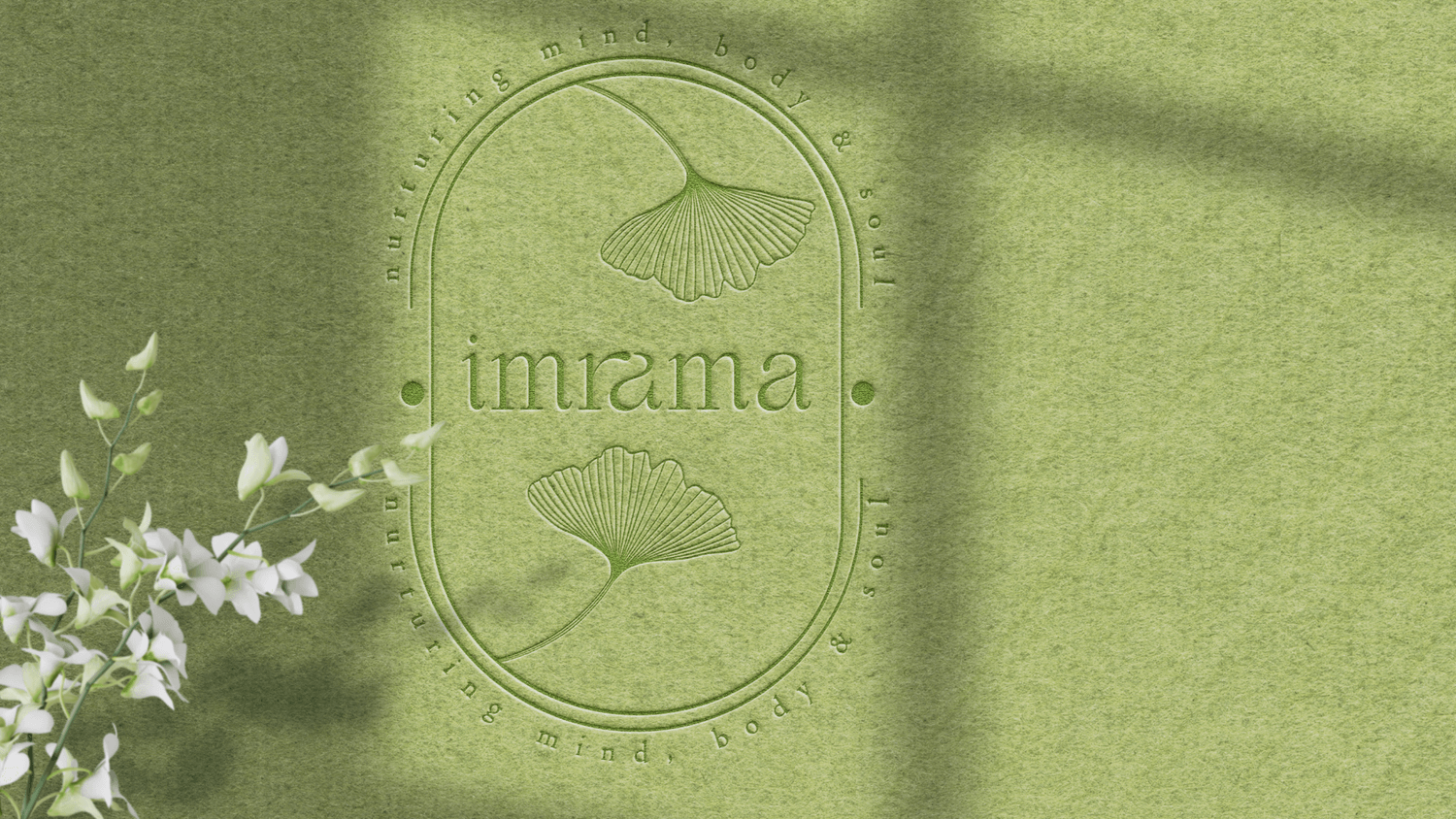
Imrama - Healthcare Brand
The logo embodies serenity and balance with its elegant, nature-inspired design. Set against a soft green backdrop, the emblem features delicate ginkgo leaves—symbols of longevity and renewal—framed within a minimalist oval shape. The refined typography of "imrama" harmonizes with the surrounding phrase “nurturing mind, body & soul” reflecting the brand’s core purpose. With a gentle, earthy aesthetic, the logo captures Imrama’s commitment to holistic well-being, offering a peaceful journey toward inner harmony and conscious living.


Exteriaa - Facade Design Brand
The Exteriaa logo embodies architectural precision and modern innovation. Its sleek and structured design reflects the brand’s expertise in façade design, engineering, and lighting solutions. The clean lines and balanced typography convey a sense of professionalism and creativity—perfectly aligning with Exteriaa’s commitment to delivering cutting-edge, customized exterior solutions.


Prominent Builders - Real Estate Brand
The logo blends architectural elegance with strong branding. The golden outline of the letter "P" seamlessly integrates with high-rise structures, symbolizing growth, strength, and ambition. Its sleek, modern design reflects the company's dedication to constructing contemporary and reliable spaces across UP and Delhi, establishing Prominent Builders as a name synonymous with trust and excellence in real estate.


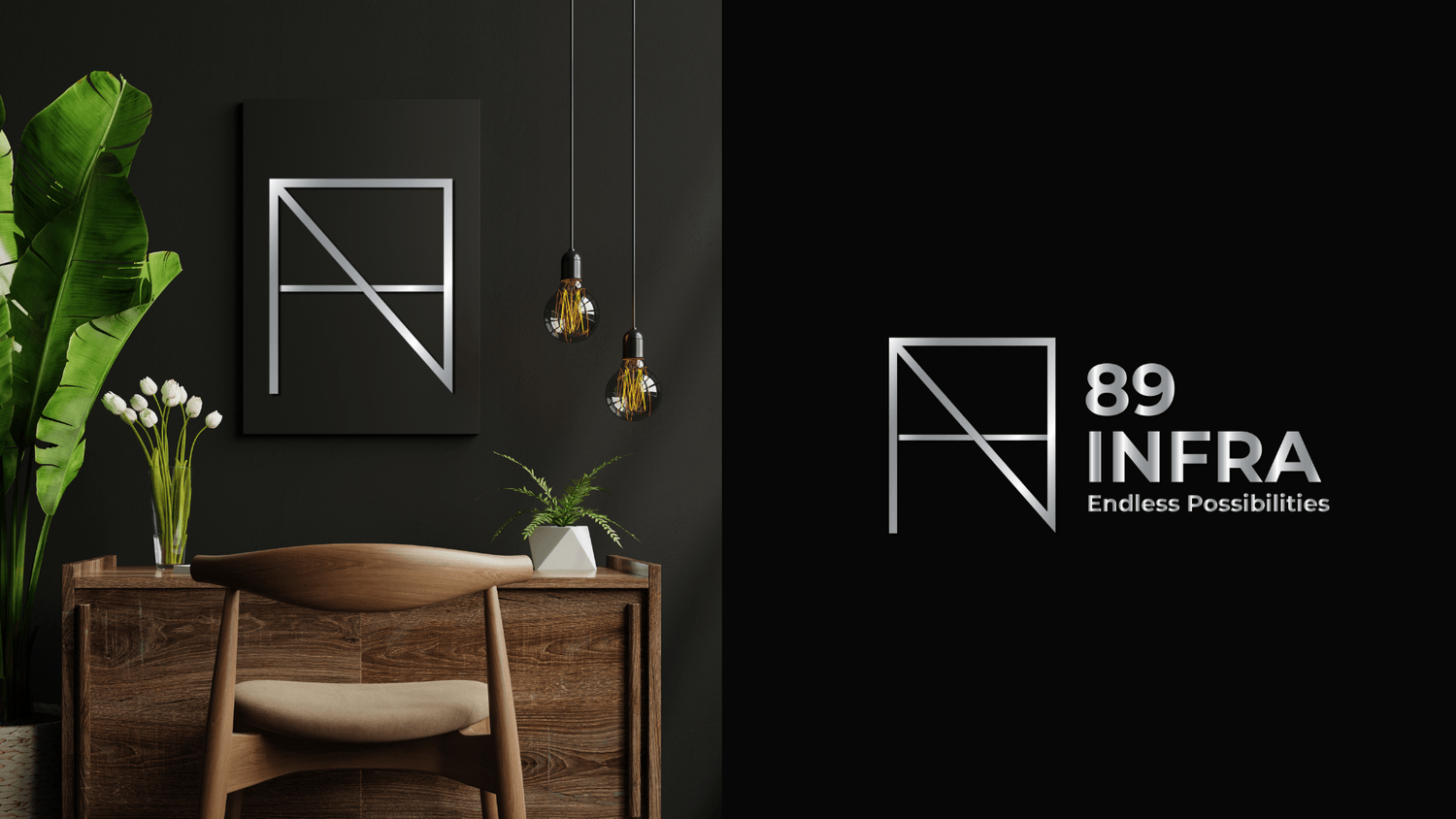
89 Infra - Interior Brand
A visionary real estate developer based in Bangalore, 89 Infra crafts premium, design-forward spaces that elevate urban lifestyles. The sleek, architectural logo reflects the brand’s core values—precision, innovation, and strength—mirroring the structural excellence they bring to every project.


Leonis Walk By Suraj
A bold identity that captures the essence of premium, customized footwear. The ‘L’ forms subtle footsteps, while the shoe sole in place of ‘I’ highlights their unique approach. Strong, masculine typography meets a luxe black and gold palette, reflecting exclusivity without showing an actual shoe—perfectly aligning with their diverse product range.


Mom's Bakery Brand
The logo radiates warmth and affection with a playful heart-shaped design featuring smiling cupcakes as eyes — symbolizing joy and homemade love. The intertwined “MB” in soft pink and blue hues evokes a sense of care and freshness. This charming branding reflects the essence of a beloved retail shop in Hyderabad, dedicated to serving freshly baked delights that feel just like home, every single day.


Baby Aroosa - Luxury Baby Brand
Luxury baby apparel brand, we designed a logo that embodies elegance and comfort. The sleeping baby illustration with pastel wings reflects the brand's focus on gentle, high-quality products. The soft color palette and rounded typography convey warmth and sophistication, aligning with Baby Aroosa's commitment to providing premium, stylish essentials for newborns.


Sara Aesthetic Clinic
A sleek, minimal silhouette of a confident figure inside a muted blush circle reflects beauty, strength, and grace. The soft serif typography complements the elegant tone, aligning with the clinic’s focus on refined, body-positive aesthetic treatments.


Kabra Emporium - Indian Saree Brand
For Kabra Emporium, a legacy saree brand, we crafted a vibrant logo that merges tradition with modern appeal. The bold “K” mark—formed with petal-like elements—evokes heritage and femininity, while the elegant typography and warm orange tones reflect celebration, culture, and timeless grace. The identity captures the essence of a brand rooted in elegance and elevated for today’s discerning customer.


Murshed Sons - Heavy Machinery Brand
We designed an industrial-inspired logo for Murshed Sons that integrates core elements of the construction world into its typography. The crane forming the letter "M", the hook suspended from the "H", and the mechanical base under “Sons” create a bold, illustrative identity that captures the brand’s expertise in heavy equipment and infrastructure. The striking orange palette adds energy and strength, reinforcing their robust industry presence.


Varg Physiotheraphy Clinic
For VARG, a physiotherapy and movement studio, we crafted a dynamic logo that blends clinical precision with human-centered design. The mark features stylized figures in motion within a structured frame, paired with bold, modern typography and a medical cross—symbolizing care, science, and strength. The identity reflects VARG’s commitment to empowering recovery through purposeful movement.


The Kapda Story - Women's Apparel Brand
Born from a vision to make fashion both elegant and accessible, The Kapda Story is a women’s apparel brand that blends traditional charm with modern sensibilities. We designed a logo that captures this balance—reflecting the brand’s essence of empowerment, affordability, and everyday luxury for the modern Indian woman.


Smitam Jewels- Women's Jewel Brand
It is an Indian jewellery brand rooted in heritage and refined with modern luxury. We crafted a logo that embodies timeless elegance—merging traditional motifs with contemporary finesse. The design captures the brand’s core values of grace, sophistication, and enduring craftsmanship, setting the tone for a refined and cohesive visual identity.


Banjara Lensers - Wedding Photography
We created a whimsical yet refined logo for Banjara Lensers, blending creativity with cinematic charm. The “A” in BANJARA transforms into a walking figure made from a vintage film camera—complete with a cap and shoes—symbolizing the brand’s storytelling spirit and nomadic lens on weddings. Elegant serif typography adds a touch of sophistication, balancing playfulness with professionalism.


Cubicle Craft - Interior Design
We designed a bold, modern logo for CubicleCraft that reflects their expertise in functional workspace design. The stylized "C" formed by geometric shapes symbolizes modularity and precision—core to their design philosophy. The mustard yellow adds warmth and creativity, while the clean typography ensures a professional, contemporary look.


Liked the work? Connect with us now👇